
Hear Her Texas
Making critical maternal health information easier to find, understand, and act on.
Client:
Texas Department of State Health Services
Project:
Hear Her Texas
Services:
UI/UX Design · Information Architecture · Front-End Development · Responsive Design · Accessibility & QA
Technology:
Bootstrap 5.1.3
Website:
hearher.texas.gov
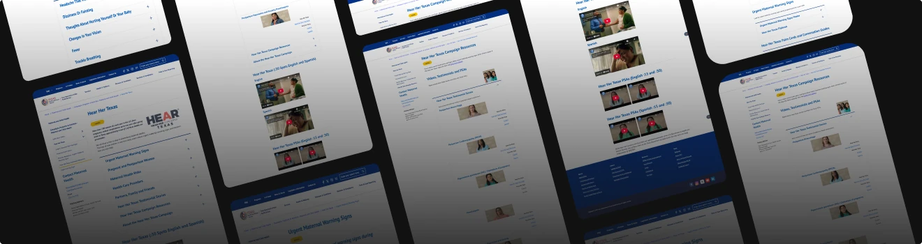
The Challenge
Hear Her Texas is a maternal health initiative from the Texas Department of State Health Services designed to help women, families, caregivers, and health care professionals recognize urgent maternal warning signs and take action when something doesn't feel right.
The campaign contained a significant amount of important information—from warning signs and maternal risk factors to personal stories, provider information, educational materials, and downloadable campaign resources.
Our challenge was to turn that growing library of public-health information into a more intuitive digital experience while working within the technical, accessibility, and compliance requirements of a State of Texas website.
Our Approach
Pickled Agency worked through the experience from the user's perspective first.
Rather than treating the website as a collection of documents and individual pages, we created clearer pathways around the questions visitors are actually trying to answer:
• What warning signs should I know?
• What factors could put me at greater risk?
• What should I do if something doesn't feel right?
• How can I help as a partner, family member, friend, or health care professional?
• Where can I find materials and resources?
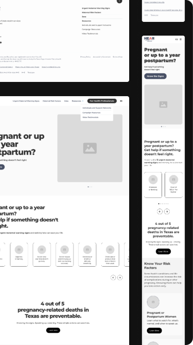
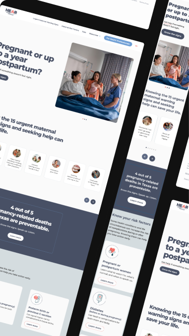
Wireframes and UI concepts established a clearer visual hierarchy before development began. The finished interface uses approachable content sections, cards, calls to action, imagery, and audience-specific pathways to make a large amount of health information easier to scan and navigate.
Designing for Urgent Information
This wasn't just a branding or visual-design exercise.
For maternal health information, finding the right content quickly can matter.
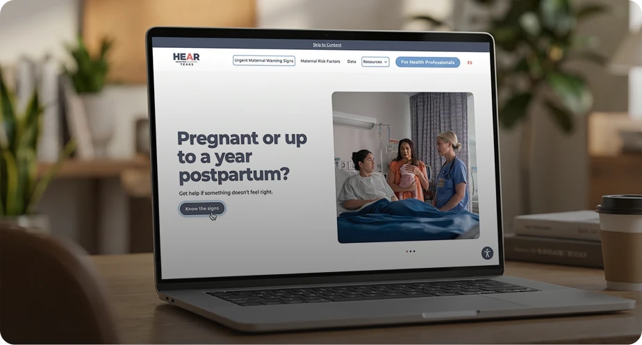
The redesigned experience places urgent maternal warning signs prominently within the user journey and connects visitors to deeper information when they need it. Risk-factor education, personal stories, downloadable resources, and information for different audiences are organized into distinct, understandable sections rather than competing for attention.
The result is an experience that can progressively move someone from awareness to education to action.
Accessible by Design
Accessibility was incorporated throughout design and development rather than treated as a final compliance check.
Our process included:
- • Accessible color and contrast review
- • Semantic HTML structure
- • Logical heading and content hierarchy
- • Keyboard-accessible interactive elements
- • Appropriate use of ARIA where needed
- • Automated accessibility scanning
- • Manual keyboard and screen-reader review
- • Cross-browser and cross-device testing
- • Issue remediation and regression testing
The work was guided by WCAG 2.1 A/AA, Section 508, and Texas Electronic and Information Resources accessibility requirements.
Accessibility was incorporated throughout design and development rather than treated as a final compliance check.
Our process included:
• Accessible color and contrast review
• Semantic HTML structure
• Logical heading and content hierarchy
• Keyboard-accessible interactive elements
• Appropriate use of ARIA where needed
• Automated accessibility scanning
• Manual keyboard and screen-reader review
• Cross-browser and cross-device testing
• Issue remediation and regression testing
The work was guided by WCAG 2.1 A/AA, Section 508, and Texas Electronic and Information Resources accessibility requirements.
Responsive
Front-End
Development
The microsite was developed using Bootstrap 5.1.3, HTML, CSS, and JavaScript, with a responsive, mobile-first approach.
Design and development worked together throughout implementation so that the finished site retained the visual intent of the approved experience while remaining practical, performant, maintainable, and compatible with the State's technical environment.
The Experience Today
The live Hear Her Texas experience now brings several important types of maternal-health content into a unified, branded digital experience:
Urgent Warning Signs
Critical symptoms are surfaced early and supported by more detailed information for visitors who need to understand what a warning sign may look or feel like.
Maternal Risk Factors
Visitors can learn about conditions and circumstances that can increase the risk of pregnancy-related complications.
Audience-Based Navigation
Pregnant and postpartum women, health care professionals, and family members or partners can find information relevant to the role they play.
Real Stories
Firsthand experiences from Texas women and families help connect clinical information with real-world situations.
Campaign Resources
Posters, guides, educational materials, and other resources are organized into a more visual and approachable library.
The Result
Hear Her Texas became more than a repository for campaign materials.
The project transformed complex public-health content into a responsive, accessible, audience-centered digital experience designed to help Texans find important maternal-health information and know what to do next.
For Pickled Agency, the project represents the intersection of thoughtful UX, strong visual design, accessible front-end development, and mission-driven public-sector work.